
Welcome to 5 Core Digital Marketing; weunderstand the importance of having a captivating and
user-friendly best mobile website design in today's digital landscape. With our expertise, we ensure that your website not only looks stunning but also functions seamlessly across all devices, providing an unparalleled user experience.
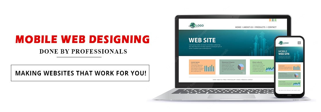
As a leading mobile website design company, we take pride in our ability to transform your vision into reality. Our team of skilled mobile website designers utilizes the latest technologies and design trends to create engaging and responsive websites that drive results.
Let's Explore the Benefits of the best mobile website designs
-
• Enhanced Brand Image:
A well-designed website by a professional mobile web design company enhances your brand image and credibility, leaving a lasting impression on visitors.
-
• Increased Engagement:
By providing users with a seamless browsing experience, our mobile website designs encourage higher engagement and interaction with
your content. -
• Improved Conversions:
A user-friendly best mobile website design is more likely to convert visitors into leads or customers, ultimately driving sales and revenue for your business.
-
• Cross-Device Compatibility:
With our responsive designs, your website will look and perform flawlessly across various devices, ensuring a consistent brand experience for all users.
Why Choose Us
-
• Expertise:
With years of experience in the website design and development industry, our team possesses the expertise and knowledge to create mobile website designs that not only look visually appealing but also function seamlessly across all devices.
-
• Customization:
We understand that every business is different. That's why we offer customizable solutions to meet your
specific requirements and objectives. Whether you need the best mobile site design or a futuristic e-commerce platform, we have you covered. -
• User Experience:
Our primary focus is on delivering an exceptional user experience. We ensure that your mobile website is intuitive, easy to navigate, and optimized for conversion, resulting in higher engagement and customer satisfaction.
-
• Responsive Design:
In today's mobile-centric world, having a responsive website is essential. Our mobile website designing company
speicializes in creating responsive designs that adapt
seamlessly to various screen sizes, ensuring a consistent experience across devices. -
• SEO Friendly:
A well-designed mobile website can significantly impact your search engine rankings. We implement best practices in mobile web design to ensure that your site is optimized for search engines, helping you attract more organic traffic and improve your online visibility.
Whether you are a small business or a large enterprise, our mobile website design company is dedicated to delivering top-notch solutions that exceed your expectations. From conceptualization to implementation, we work closely with you to develop a mobile website that reflects your brand's identity and resonates with your target audience.
Partner with 5 Core Digital Marketing today and experience the difference that our best mobile site design services can make for your online presence. Reach out to us to learn more about our mobile website design packages and take the first step toward maximizing your digital impact.